https://drive.google.com/drive/folders/1GfSjDOPHL2_YXczw-iR1h9_F59SZygBP?usp=drive_link
Wednesday, April 10, 2024
Creative Critical Reflection
In creating “The Sound Between Us,” I relied a lot on my personal experiences. The short film aims to depict the relationship between two brothers broken up across different points in time, told non-chronologically.
I told the story non-chronologically because arguments between people span across many periods of time, not just one singular point. Every conflict is just a build up of past transgressions and emotions that have been threatening to spill. “The Sound Between Us” represents the domestic household and particularly the relationship between brothers. I drew heavily from my relationship with my brother, though mine is certainly not as tumultuous as the one depicted in the short film. The first layer of engagement, I feel, is to make a relatable story. I like to write naturalistic dialogue with a lot of pauses, stutters, and sly looks. Martin, the older brother, is kind of snarky and definitely condescending but also aggressive and sympathetic at the same time. The monologue in the final scene is meant to underscore his motivations throughout the piece.
I wish I would have included a connective scene between Martin accepting that his younger brother is going to college and the one where he slams the piano. I think the final scene comes a bit suddenly and audiences might feel whiplash from the difference in characterization that Martin goes through. Because the relationship is between brothers, both of whom are near college age, the target audience for this piece is between fourteen and thirty. For the sake of realism, I wrote in multiple mentions of their parents, though they’re never seen on screen. Again, this was something that seeped in just from my real-life experiences with my older siblings berating me for not doing enough or doing things that they did not agree with.

The branding of the short film is created mostly through the usage of the title cards and the different dates. This is also prominent on the Instagram account which shows a variety of visuals but has a focus on blank, bold visuals that parallel those found in the short film. The idea of chronology is the very premise of the film, that these brothers have arguments so similar to each other over time. One film that has a non-chronological narrative is “Eternal Sunshine of the Spotless Mind”. In “Eternal Sunshine,” the relationship between the two main characters is built through flashback and a constant build up and exposition on their relationship troubles. Only through this, can we see the ending and the resolution between their personal arcs. Similarly, “The Sound Between Us” utilizes non-chronology to characterize their relationship and growth but also continuing conflict over time. Only by showing the scale of their lives could I show the audience the meaningfulness of Martin’s final decision, which was to be appeased and let the younger brother go.
The color grading for difference sequences varies. For instance, when they are in the kitchen, I muted the colors for a washed out look. This caused their argument in the kitchen to appear less dramatic and more everyday in nature. However, when Martin and the younger brother argued by the piano, I increased the saturation to make the walls more yellow and the shadows darker. Their argument by the piano is much more dramatic.
 |
| An adjustment layer to make the hallway consistently yellow |
The subtle messaging of the film, mostly because I didn’t spend enough time talking or suggesting it, is that one should not lead their lives passively. My biggest failure was really in pre-production, considering I had to change my entire premise only a week and a half before the portfolio project was due. I changed the premise but remained focused on the aspect of family. Martin is meant to represent a person who craves stability more than anything else and isn’t sure of how to confront his younger brother, who represents passion and joy for something else, something larger. I wanted to represent a common issue found within families, the inability to openly show affection because of petty reasons like arrogance or fear. For both premises of this film, I wrote characters whose primary conflict was how closed off they were from their family. Though there is a semblance of that in “The Sound Between Us,” I think it’s much more in the background which is regrettable.
One powerful convention in films that are focused on family is the underlying love behind anger. “Parasite” and “Moonlight” are two films which depict families who don’t get along in orthodox ways. Similarly, the character of Martin may be a sort of antagonist, but he doesn’t hate his younger brother. The importance of the story is that it’s his love for his younger brother which drives him to do what he does, even if it’s expressed unhealthily. I think this is an engaging element.
 |
| A scene that ends in bottles being shattered in Parasite. |
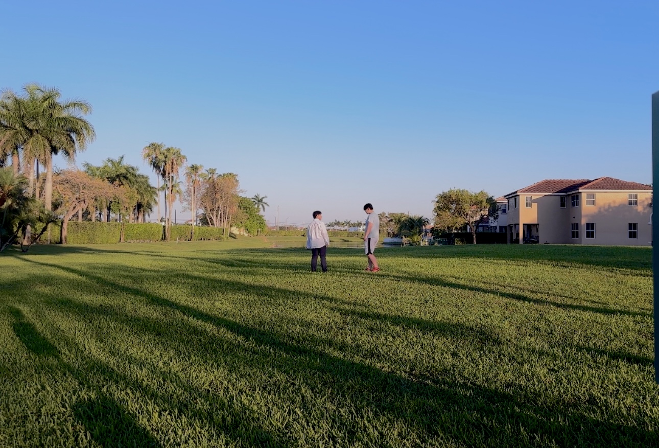
The postcard for my film assists in branding by being consistent with the font but focusing on the scenic shots which frame Martin and his brother or just the brother alone. I wanted to capture a lot of picturesque shots and the two I chose for my postcard were some of my favorites, though one of them didn’t make it into the final cut. There’s beauty and serenity in family which I wanted to show through meditative and contemplative sequences such as the end where Martin is walking around in his backyard.

Working on this project has made me see how to pace a screenplay better. I struggled greatly with trying to fit a story within the allotted time and even after extending it, I was not happy with all the plot points. I feel the premise is strong, though, and the visual style of the piece is something I’m quite satisfied with, barring some of the camerawork. The branding is also weak, and my social media needed more work. This was a huge step forward in my post and pre-production capabilities and I think if I would have done a better job with pre-production, I could have shot much better.
Post Production


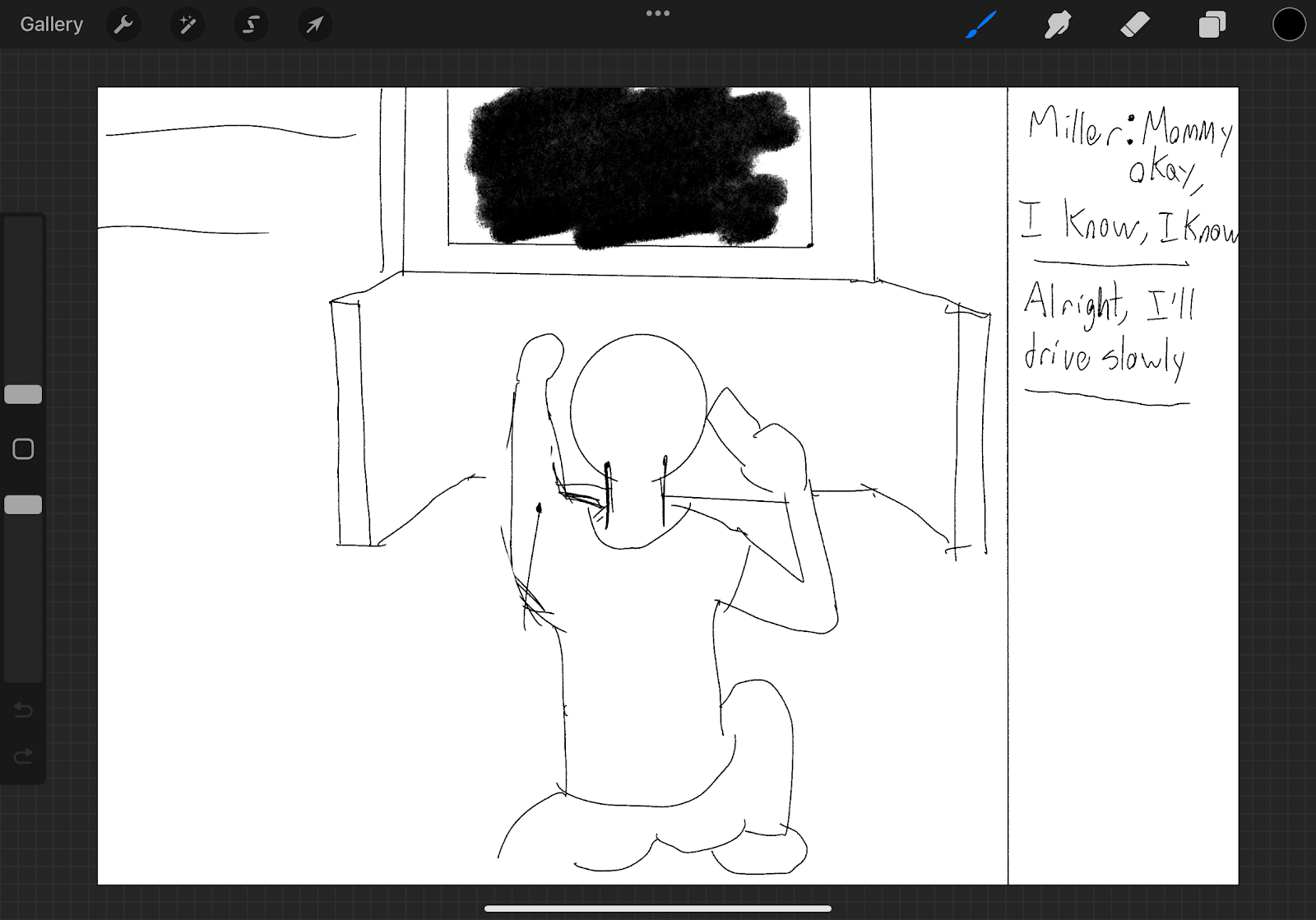
Here, I put an adjustment layer over the scene of Martin and his younger brother arguing by the piano in the hallway. I made this scene more yellow and wanted a consistent grade over the whole scene so nothing was off putting. Of course, the actor wasn't really playing piano either.

Here is the audio editing, replacing the audio of his piano with Moonlight Sonata 3rd Movement.
Postcard Front and Back


I've settled with these two as my postcard front and back. The front is suave and also the black fits the costume on my character in that scene. It has the film festival and personal information while on the back, there is a link to the Instagram account.
Sunday, April 7, 2024
Print Component Templates


Again, neither of these are quite finished yet. Especially the postcard as I still need to establish screening locations and also get rid of those very wishful festival selections. These will both act as templates and hopefully, I can get the image to export with equal quality on my final revision.
Colored Graded Footage
I’ve been working on the edit for the film and ever since last year, one of my favorite things to do was color grading. Now, I’m not an expert on color, though I do think of myself as a very decent observer of it in films and other media, I do have a general grasp on how to make things look better than they are. Especially in adobe premiere with the curves (the top of the curve being highlights and the bottom being shadows, adjusting either end will make the shadows or the highlights look darker/brighter, the middle is mid tones).
I still need to go over some of the footage with a mask—since I want to make the sky look a certain way but not the people in the footage. So, I’ve compiled a couple of shots that I’ve color graded. There’s one very important scene I still need to grade as I want the sky to look a very deep dark blue in that scene. The line edit is coming along as well and I plan on finishing the editing very soon.


These three shots are not graded


These three are graded
The style I wanted with the grading was a moodier, more stylized visual with luscious tones but an overall more muted vibrancy.
4/2 Group Meeting

I had to change my entire premise while sticking to the family theme because of a conflict with my actors. Also, a really tight schedule forced me to have to essentially be happy with my footage shot over one or two days at most. I would have been much happier if it were my schedule stopping me from filming as much as I wanted but it was actually my actors who ended up limiting the amount of times I could film. It’s no one’s fault and they’re doing it voluntarily but it’s still upsetting that I could have ended up with a much better product than I have.
The group meeting really told me that I had a lot of work to do outside of production. Everyone seemed to be well on their way with their social media while I was just getting off the ground and thinking of what to post. My print component was also just coming together. That’s what I’m going to be working on this week, getting up to speed with everything.
Sunday, March 24, 2024
Current Favorite Shots
 |
| The lighting was great during our shooting. It’s slightly overwhelming but it’s also sort of angelic and dreamy, completely on base with the emotions that I want to convey with this piece. After color grading, I can likely make this look even more ethereal. |

I loved the orange accents from the sun in the background. The clutter was semi-intentional but it was poorly composed on my end. If we retake this scene, I want to be more purposeful with the props on the table, if it’s possible. Otherwise, this scene is a little too dark and is also cropped due to the lighting being slightly visible in the top left corner. I’ll have to resize it if I go with this shot which isn’t likely but I do have to say, I liked the colors.

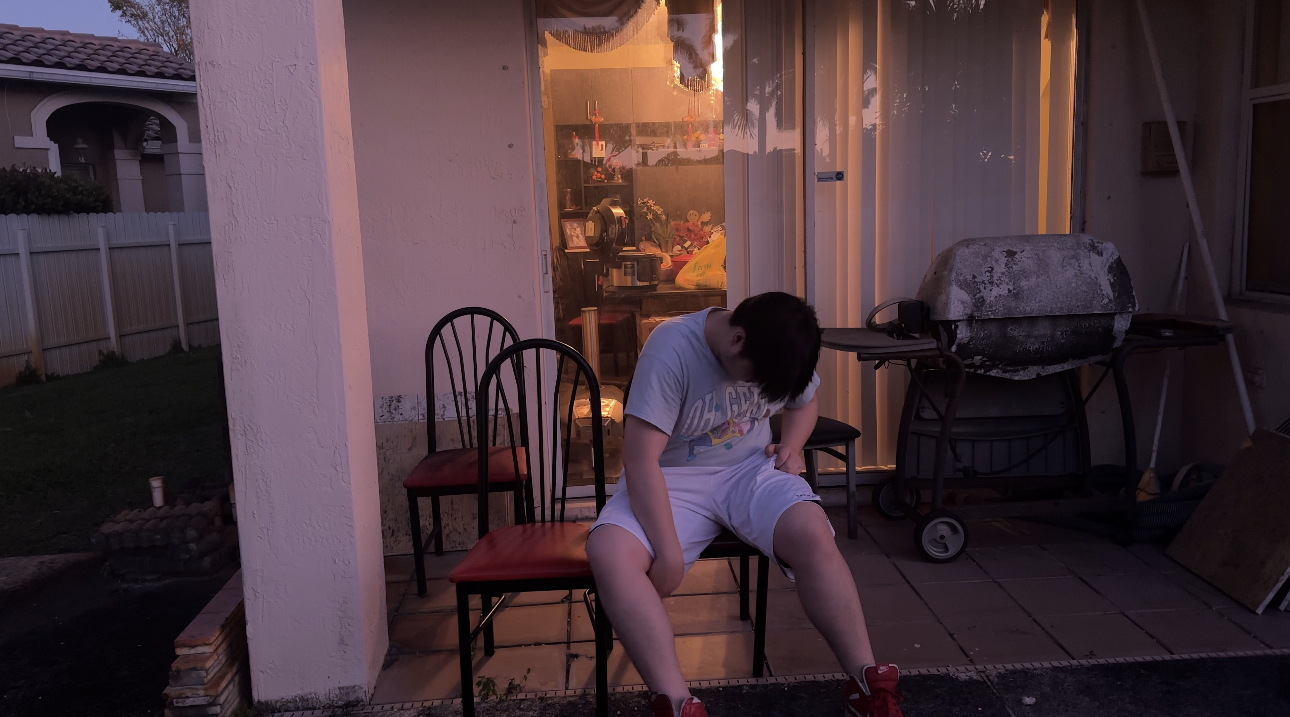
Once again, the gold accents from the lighting of my house comes through. I really loved how this sequence played out, our main character in the shadow, continuously building his identity as he learns and remembers things new and old from his childhood in a new, grown up lens. This also will parallel another hallway scene from earlier in the piece and it’s largely symbolic but also very pretty in my humble opinion.

A dramatic shot with our protagonist looking into a bedroom where his younger self and father slept in. This is following a scene where the father and his brother argued and this scene captures his hesitance and reluctance to learn a new, more emotional side of his father.

This shot is of our father after the brother leaves the house post-argument. Its cool tone contrasts the warmth of many of the other shots and the shadow captures the father’s instantaneous regret but also his pride and inability to change, making his character development at the end (telling his son he is proud of him) all the more powerful.
These were my favorite shots from the filming so far. I have a ton of footage but these were stand-out to me and I thought they captured the feeling of the narrative very well. Also, the importing process into blogger has scaled down the resolution of the images for some reason. They look a lot better in the footage I have access to.
Editing Issue (and More Research)
I'm aware this isn't the best time to see this but only after I shot was the issue prominent on my mind: how am I going to shoot this?
Given my story, there are two main options:
1. Shoot the scenes of the modern day and past separately, then blend them.
2. Shoot the scenes of both actors all on the same frame.
The reason 1 is preferable is that even if I shot the entire thing very poorly (and in truth, I'm not entirely enthusiastic about the footage I do have), it would still be extremely clear what's happening when the young protagonist and father faze through the protagonist (in that the audience would be aware it's just a flashback or some sort of thought in the protagonist's head). The reason I would do 2 is because it's just more convenient. I have hardly a clue how to edit the first option, even though I'm pretty sure most films that do something similar with memory to mine shoot in that way. So far, I have a couple of shots which are appropriate to blend/be overlaid, but there's a lot of camera movement in those and I'm afraid what the finished product is going to look like.
Moreover, and this isn't an editing issue, but I just didn't do a good job with mise-en-scene. My actors wore the same clothes the entire shoot which means I may as well throw out a good portion of shots, especially when our father is supposed to age throughout the piece. The hard truth is that I'm growing increasingly nervous about this piece. The scale isn't that large but most of what will make the idea worthwhile seems to be out of my expertise or requires much more planning than I initially thought.
 |
| Add grain to indicate our character is looking at a flashback?? Maybe it can work but it doesn't make complete sense to me. |
I've also come across suggestions to use a filter to indicate the scenes of the past but that literally makes no sense. The flashbacks aren't really flashbacks but our character's current understanding of them—a recontextualization after his maturation from his childhood! That's the entire premise. I don't even have enough experience in this field to practice it because I just opened adobe and I have no idea how to even do the first step of the blending that the first video I watched told me to do. I feel stupid only trying to see how to edit this piece now, but I'm also sure I can find a way around it should it not eventually become clear to me at some point.
Sunday, March 17, 2024
Some Storyboard
I have very little storyboarding done which is regretful as I plan to start filming this coming week. However, I don't plan on starting right on Monday or Tuesday which leaves me with a couple more days to storyboard. I'm also going to largely neglect storyboarding the shots which are likely going to just be shot-reverse-shot.

My Toolbox
Over the last couple of months, I have purchased a lot of equipment to help me shoot this piece. The first is:


I also bought lighting equipment. I have two hard lights now. Although I considered buying more lighting equipment, I think I can rig a basic three point lighting system and figure out the rest afterward. Since I brought up lighting, I figured I might as well include some of my favorite examples of excellent lighting in films.
 |
| The beginning when Alex and his droogies appear as shadows |
 |
| Vito looking at Sonny |
 |
| Raise the Red Lantern |
 |
| And of course, Suspiria |
It's important to note some of my favorite lighting from films accentuate the colors on the screen. Lighting is very common, to the point that a well-lit shot to me, the viewer, feels as easy to do as breathing. But with colorful scenes from movies such as Raise the Red Lantern and Suspiria, the lighting is much more noticeable. I hope I can nail the colors like they do.
Subscribe to:
Posts (Atom)
-
So on Sundays I work (a service job…) and since the bulk of the work I wanted to do today was already finished, I asked myself, what’s an e...
-
As outlined in one of my previous posts, I wanted to dabble in color grading to really nail that filmic look to give my project some oomph. ...
