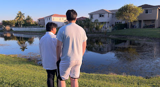
I’ve been working on the edit for the film and ever since last year, one of my favorite things to do was color grading. Now, I’m not an expert on color, though I do think of myself as a very decent observer of it in films and other media, I do have a general grasp on how to make things look better than they are. Especially in adobe premiere with the curves (the top of the curve being highlights and the bottom being shadows, adjusting either end will make the shadows or the highlights look darker/brighter, the middle is mid tones).
I still need to go over some of the footage with a mask—since I want to make the sky look a certain way but not the people in the footage. So, I’ve compiled a couple of shots that I’ve color graded. There’s one very important scene I still need to grade as I want the sky to look a very deep dark blue in that scene. The line edit is coming along as well and I plan on finishing the editing very soon.
The style I wanted with the grading was a moodier, more stylized visual with luscious tones but an overall more muted vibrancy.


No comments:
Post a Comment